Infographics are used to illustrate a concept with appealing graphics and little or some information. The point is to create a visual that resonates with your reader while offering just enough information to spark their interest or educate a layperson. Think of it as a visual outline of your long story.
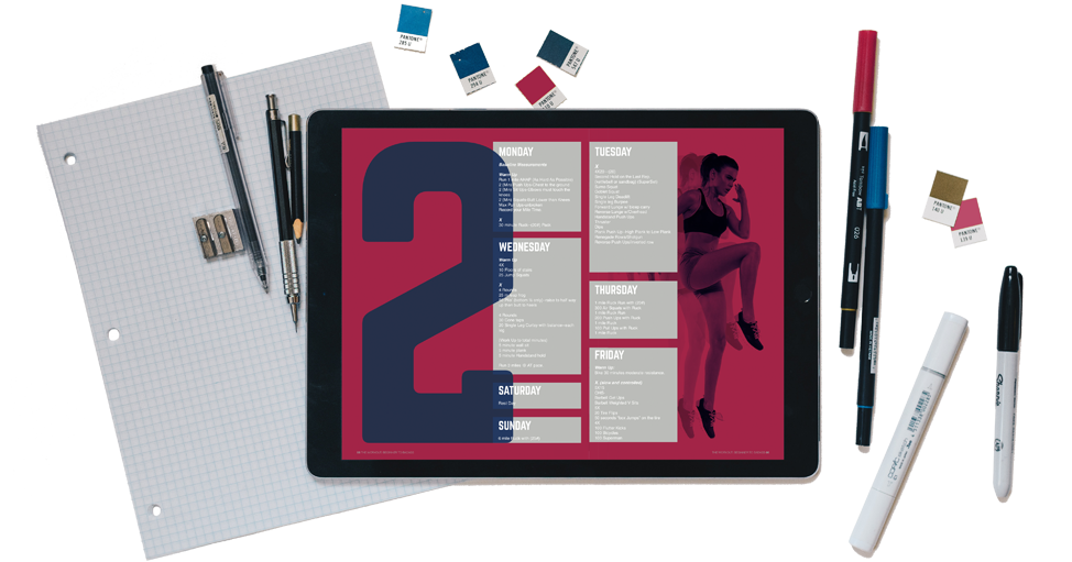
Editorial design is needed for anything from corporate brochures and business reports to dissertations and books. It is a composition of graphics and text illustrating a hierarchy of information through layout, typography, and color, without requiring too much interpretation by the reader. Showing: This is important, this is MORE important, and this is EVEN MORE important.
You have a lot of numbers and you can’t possibly expect someone to read through them all. Visual data allows your reader to quickly familiarize themselves with the facts while saving them as much time as possible. The use of charts, diagrams, colors, and visual hierarchy make immediate connections for them that help your point stand out.
While presenting a lot of information on a screen, it’s essential to design for an easy read. Unless your reader is reading a Kindle book or a quick blog, they’re going to need advanced searching, saving, and bookmarking options determined mainly by the wireframe and interface design. The last thing your reader wants when visiting your website/app is to get googly eyes trying to follow the text or spend too much time finding their place a second time.
4.1 billion people are now accessing useful content behind a screen. I want to enhance the way that information reaches them.


